Latin Writing. IV.—The Carolingian Reform and the Medieval Minuscule Hand
It has been stated above that in the Merovingian MSS. of the 8th century there was evident progress towards a settled minuscule book-hand which only required a master hand to fix it in a purified and calligraphic form. This was effected under Charlemagne, in whose reign the revival of learning naturally led to a reform in handwriting. An ordinance of the year 789 required the revision of Church books; and a more correct orthography and style of writing was the consequence. The abbey of St Martin of Tours was one of the principal centres from whence the reformation of the book-hand spread. Here, from the year 796 to 804, Alcuin of York presided as abbot; and it was specially under his direction that the Carolingian minuscule writing took the simple and graceful form which was gradually adopted to the exclusion of all other hands. In carrying out this reformation we may well assume that Alcuin brought to bear the results of the training which he had received in his youth in the English school of writing, which had attained to such proficiency, and that he was also beneficially influenced by the fine examples of the Lombard school which he had seen in Italy. In the new Carolingian minuscule all the uncouthness of the later Merovingian hand disappears, and the simpler forms of many of the letters found in the old Roman half-uncial and minuscule hands are adopted. The character of Carolingian writing through the 9th and early part of the 10th century is one of general uniformity, with a contrast of light and heavy strokes, the limbs of tall letters being clubbed or thickened at the head by pressure on the pen. As to characteristic letters (fig. 44) the a, following the old type, is, in the 9th century, still frequently open, in the form of u; the bows of g are open, the letter somewhat resembling the numeral 3; and there is little turning of the ends of letters, as m and n.
.jpg)
| |||
| Fig. 44.—Gospels, 9th century. | |||
|
In the 10th century the clubbing of the tall letters becomes less pronounced, and the writing generally assumes, so to say, a thinner appearance. But a great change is noticeable in the writing of the 11th century. By this time the Carolingian minuscule may be said to have put off its archaic form and to develop into the more modern character of small letter. It takes a more finished and accurate and more upright form, the individual letters being drawn with much exactness, and generally on a rather larger scale than before. This style continues to improve, and is reduced to a still more exact form of calligraphy in the 12th century, which for absolute beauty of writing is unsurpassed. In England especially (fig. 45) the writing of this century is particularly fine.

| |||
| Fig. 45.—Leviticus, A.D. 1176. | |||
|
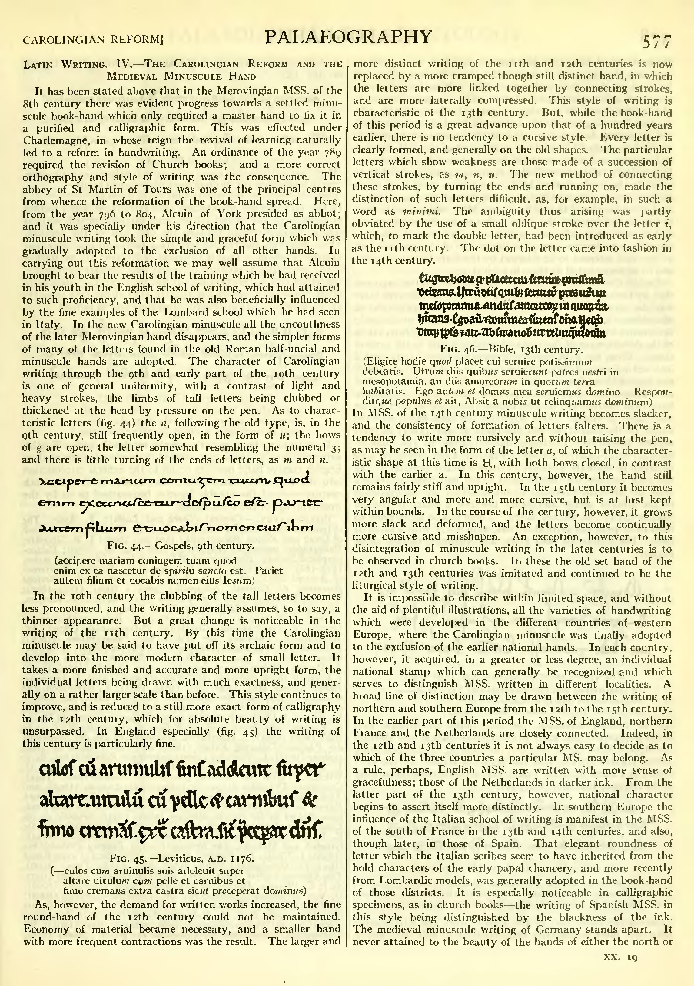
As, however, the demand for written works increased, the fine round-hand of the 12th century could not be maintained. Economy of material became necessary, and a smaller hand with more frequent contractions was the result. The larger and more distinct writing of the 11th and 12th centuries is now replaced by a more cramped though still distinct hand, in which the letters are more linked together by connecting strokes, and are more laterally compressed. This style of writing is characteristic of the 13th century. But, while the book-hand of this period is a great advance upon that of a hundred years earlier, there is no tendency to a cursive style. Every letter is clearly formed, and generally on the old shapes. The particular letters which show weakness are those made of a succession of vertical strokes, as m, n, u. The new method of connecting these strokes, by turning the ends and running on, made the distinction of such letters difficult, as, for example, in such a word as minimi. The ambiguity thus arising was partly obviated by the use of a small oblique stroke over the letter i, which, to mark the double letter, had been introduced as early as the 11th century. The dot on the letter came into fashion in the 14th century.

| |||||
| Fig. 46.—Bible, 13th century. | |||||
|
In MSS. of the 14th century minuscule writing becomes slacker,
and the consistency of formation of letters falters. There is a
tendency to write more cursively and without raising the pen,
as may be seen in the form of the letter a, of which the characteristic
shape at this time is ![]() , with both bows closed, in contrast
with the earlier a. In this century, however, the hand still
remains fairly stiff and upright. In the 15th century it becomes
very angular and more and more cursive, but is at first kept
within bounds. In the course of the century, however, it grows
more slack and deformed, and the letters become continually
more cursive and misshapen. An exception, however, to this
disintegration of minuscule writing in the later centuries is to
be observed in church books. In these the old set hand of the
12th and 13th centuries was imitated and continued to be the
liturgical style of writing.
, with both bows closed, in contrast
with the earlier a. In this century, however, the hand still
remains fairly stiff and upright. In the 15th century it becomes
very angular and more and more cursive, but is at first kept
within bounds. In the course of the century, however, it grows
more slack and deformed, and the letters become continually
more cursive and misshapen. An exception, however, to this
disintegration of minuscule writing in the later centuries is to
be observed in church books. In these the old set hand of the
12th and 13th centuries was imitated and continued to be the
liturgical style of writing.
It is impossible to describe within limited space, and without the aid of plentiful illustrations, all the varieties of handwriting which were developed in the different countries of western Europe, where the Carolingian minuscule was finally adopted to the exclusion of the earlier national hands. In each country, however, it acquired, in a greater or less degree, an individual national stamp which can generally be recognized and which serves to distinguish MSS. written in different localities. A broad line of distinction may be drawn between the writing of northern and southern Europe from the 12th to the 15th century. In the earlier part of this period the MSS. of England, northern France and the Netherlands are closely connected. Indeed, in the 12th and 13th centuries it is not always easy to decide as to which of the three countries a particular MS. may belong. As a rule, perhaps, English MSS. are written with more sense of gracefulness; those of the Netherlands in darker ink. From the latter part of the 13th century, however, national character begins to assert itself more distinctly. In southern Europe the influence of the Italian school of writing is manifest in the MSS. of the south of France in the 13th and 14th centuries, and also, though later, in those of Spain. That elegant roundness of letter which the Italian scribes seem to have inherited from the bold characters of the early papal chancery, and more recently from Lombardic models, was generally adopted in the book-hand of those districts. It is especially noticeable in calligraphic specimens, as in church books—the writing of Spanish MSS. in this style being distinguished by the blackness of the ink. The medieval minuscule writing of Germany stands apart. It
never attained to the beauty of the hands of either the north or