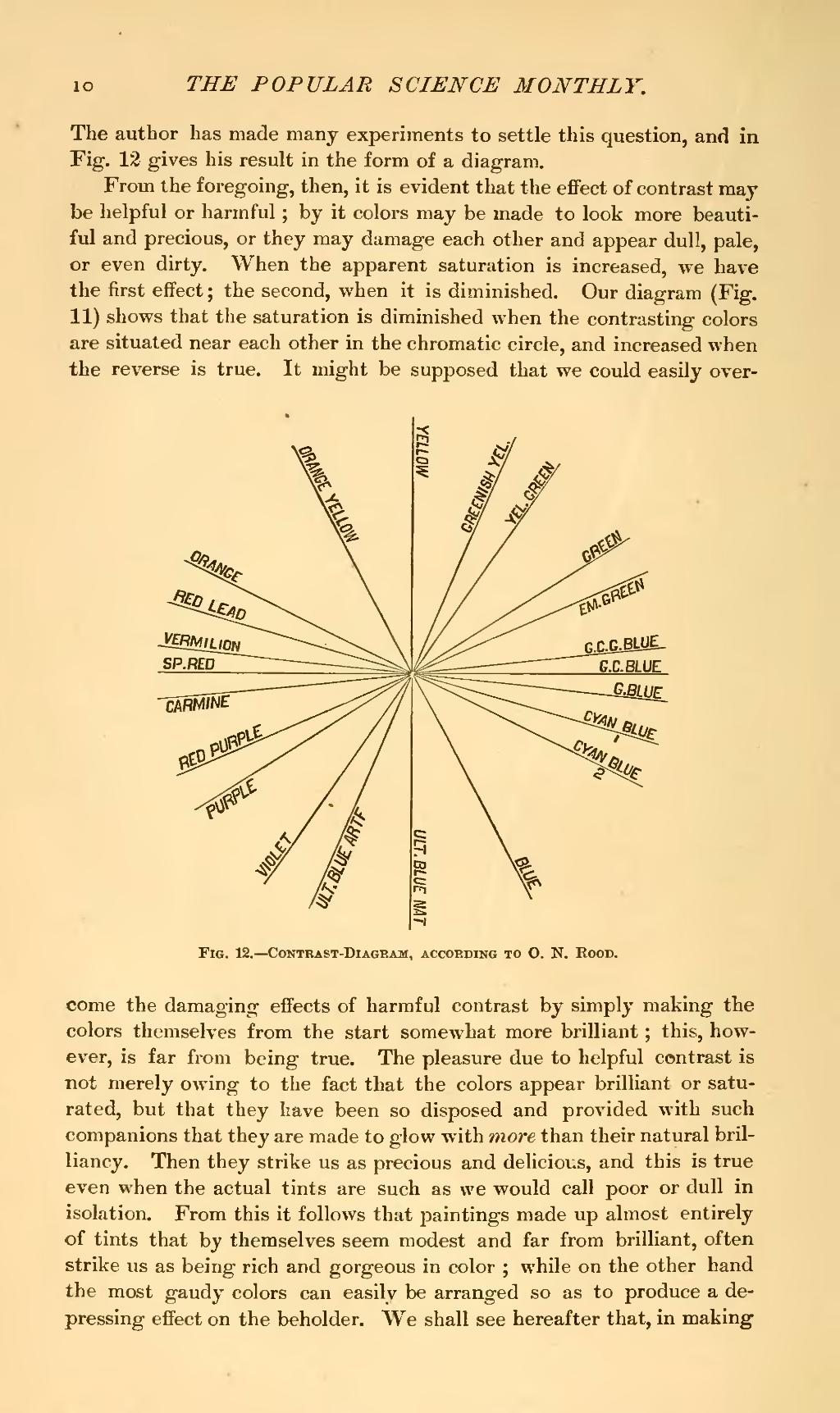
The author has made many experiments to settle this question, and in Fig. 12 gives his result in the form of a diagram.
From the foregoing, then, it is evident that the effect of contrast may be helpful or harmful; by it colors may be made to look more beautiful and precious, or they may damage each other and appear dull, pale, or even dirty. When the apparent saturation is increased, we have the first effect; the second, when it is diminished. Our diagram (Fig. 11) shows that the saturation is diminished when the contrasting colors are situated near each other in the chromatic circle, and increased when the reverse is true. It might be supposed that we could easily overcome

Fig. 12.—Contrast-Diagram, according To O. N. Rood.
the damaging effects of harmful contrast by simply making the colors themselves from the start somewhat more brilliant; this, however, is far from being true. The pleasure due to helpful contrast is not merely owing to the fact that the colors appear brilliant or saturated, but that they have been so disposed and provided with such companions that they are made to glow with more than their natural brilliancy. Then they strike us as precious and delicious, and this is true even when the actual tints are such as we would call poor or dull in isolation. From this it follows that paintings made up almost entirely of tints that by themselves seem modest and far from brilliant, often strike us as being rich and gorgeous in color; while on the other hand the most gaudy colors can easily be arranged so as to produce a depressing effect on the beholder. We shall see hereafter that, in making