RESOURCES IN MEN 89
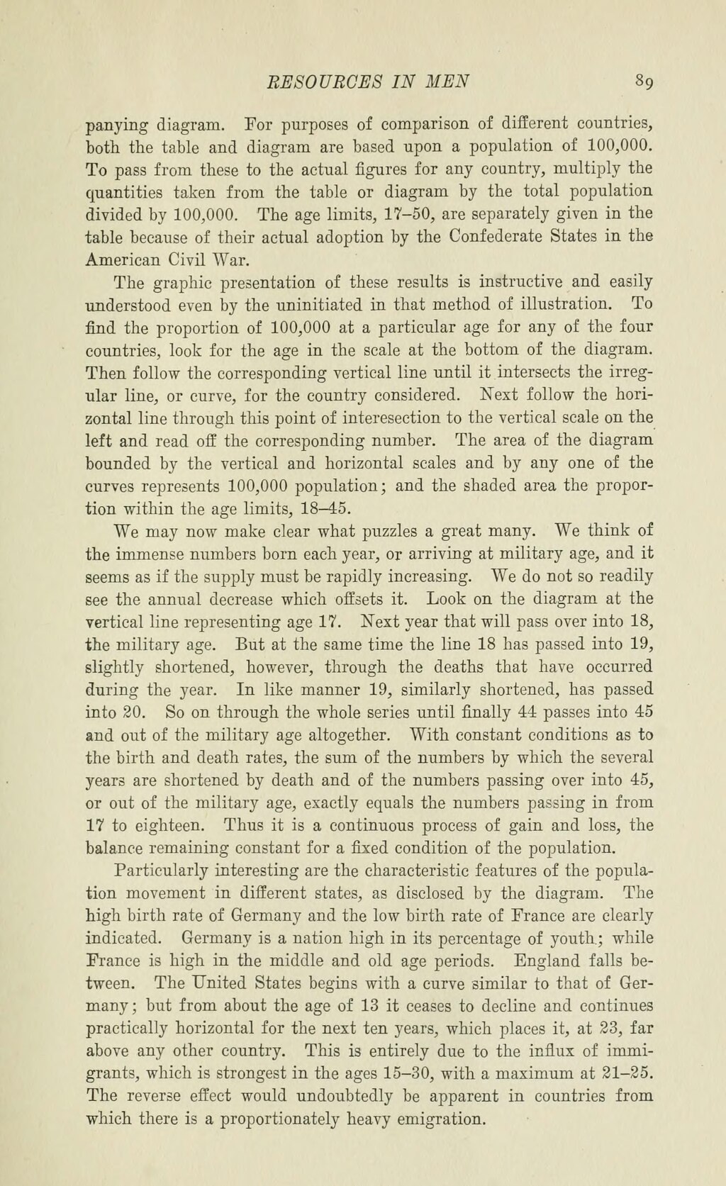
panying diagram. For purposes of comparison of different countries, both the table and diagram are based upon a population of 100,000. To pass from these to the actual figures for any country, multiply the quantities taken from the table or diagram by the total population divided by 100,000. The age limits, 17–50, are separately given in the table because of their actual adoption by the Confederate States in the American Civil War.
The graphic presentation of these results is instructive and easily understood even by the uninitiated in that method of illustration. To find the proportion of 100,000 at a particular age for any of the four countries, look for the age in the scale at the bottom of the diagram. Then follow the corresponding vertical line until it intersects the irregular line, or curve, for the country considered. Next follow the horizontal line through this point of interesection to the vertical scale on the left and read off the corresponding number. The area of the diagram bounded by the vertical and horizontal scales and by any one of the curves represents 100,000 population; and the shaded area the proportion within the age limits, 18-45.
We may now make clear what puzzles a great many. We think of the immense numbers born each year, or arriving at military age, and it seems as if the supply must be rapidly increasing. We do not so readily see the annual decrease which offsets it. Look on the diagram at the vertical line representing age 17. Next year that will pass over into 18, the military age. But at the same time the line 18 has passed into 19, slightly shortened, however, through the deaths that have occurred during the year. In like manner 19, similarly shortened, has passed into 20. So on through the whole series until finally 44 passes into 45 and out of the military age altogether. With constant conditions as to the birth and death rates, the sum of the numbers by which the several years are shortened by death and of the numbers passing over into 45, or out of the military age, exactly equals the numbers passing in from 17 to eighteen. Thus it is a continuous process of gain and loss, the balance remaining constant for a fixed condition of the population.
Particularly interesting are the characteristic features of the population movement in different states, as disclosed by the diagram. The high birth rate of Germany and the low birth rate of France are clearly indicated. Germany is a nation high in its percentage of youth; while France is high in the middle and old age periods. England falls between. The United States begins with a curve similar to that of Germany; but from about the age of 13 it ceases to decline and continues practically horizontal for the next ten years, which places it, at 23, far above any other country. This is entirely due to the influx of immigrants, which is strongest in the ages 15–30, with a maximum at 21–25. The reverse effect would undoubtedly be apparent in countries from which there is a proportionately heavy emigration.